Mixed White Balance
I’m sure we all understand how important it is to set the correct white balance. I tend not to get too hung up on ‘correct’ though, preferring an image to look good rather than be totally accurate. White balance is usually set in camera, or, for raw files, in the raw processor later on, but 9 times out of 10 it will be set once and then left alone – it’s usually thought of as a *global* setting affecting the whole image.
But why should this be only global?
Consider taking a photo of a flower on a sunny day. The colour temperature of sunlit flower will be about 5500K, whilst any shadows, which are only illuminated by blue sky (that’s why they are shadows), will be considerably bluer at about 7500K. If you choose Daylight white balance you will end up with neutral sunlit areas as expected, but the shadows will have a distinct blue cast.
The image actually has two different light sources (the yellow sun and the blue sky) with two different colour temperatures, and yet we can only set one white balance. It therefore follows that one part of the image will have the wrong white balance – choose Daylight and the sunlit areas will be correct but the shadows will have a blue cast or choose Shade (or Cloudy) to correct the shadows and the sunlit areas will be far too warm.
If nature sees fit to offer us two differently tinted light sources, then maybe we should do the same.
Shooting in the shade.
When photographing flowers (or people) when the sun is high it’s common practice to head for the shade where the light source is only the huge blue sky and is thus nice and soft. We can set a white balance for Shade and all is good – mostly.
The problem is that the results look a bit flat from a colour and contrast point of view. We like the sunlit look of warm light washing over our subject but it’s usually too harsh and so we have sacrificed that sunlit but harsh look for cooler, soft light, corrected with a white balance shift.
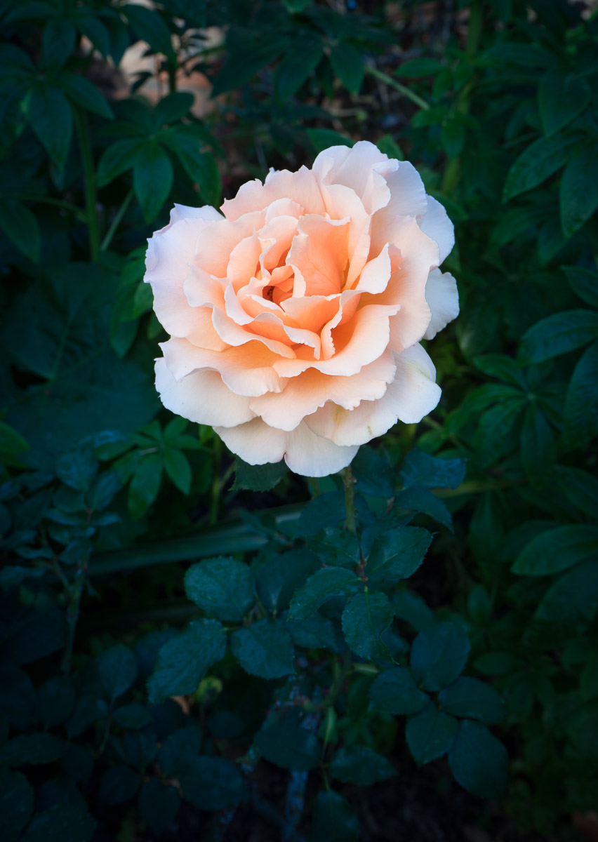
Here’s a typical example. This rose was shot in the shade and the colours are roughly correct if a bit flat – the pinky-orange of the rose is there but the shaded parts still have a blue tint.
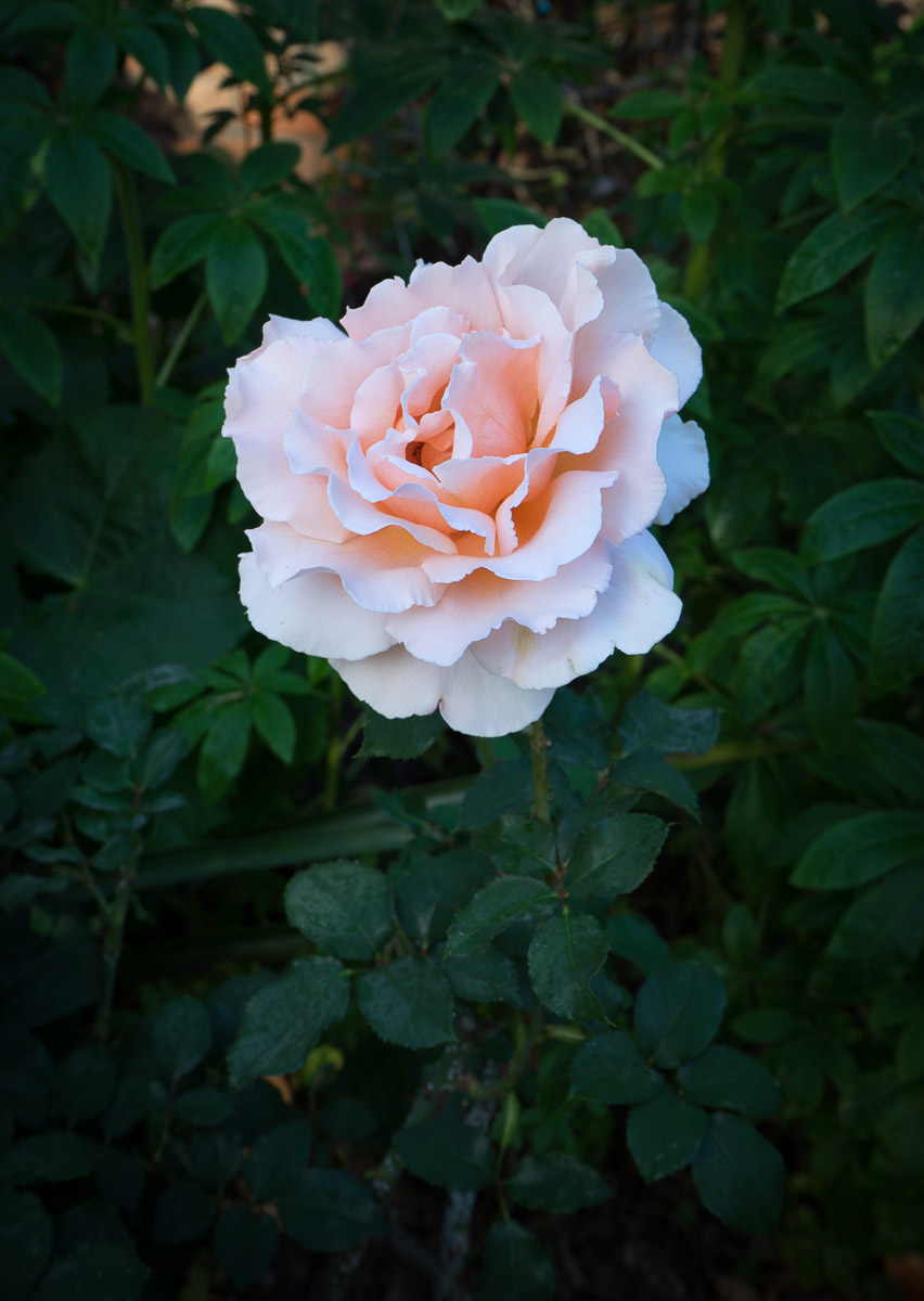
Here’s the same shot with the white balance set to Tungsten – the opposite of what you should do. As you’d expect it’s very blue but I like the way the background recedes and becomes less distracting. Blue colours recede and warm colours come forward but the overall tone is way too cool.
I can do two things here:
1. Using the Local Adjustment brushes in Lightroom, or Adobe Camera Raw, selectively change the WB for the rose to Shade which will give it a big shift in warmth. This can work extremely well but I do run the risk of that selection bleeding into the background and looking a bit odd. It also only works if you are shooting raw.
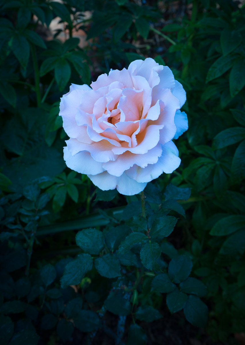
2. Or I could add my own light, filtered with a warm gel to be ‘correct’ for the chosen tungsten WB setting. If the light is close to the subject, it will fall off quickly and not contaminate the background and, better still, it’s more directional than the soft blue sky illumination – so the rose looks more 3D.
I used a 16″ Lastolite Ezybox with a flash inside, gelled with a full cut of CTO filter gel – orange to emulate indoor lighting. This gives me a close-in soft light that brings out the colours of the rose but leaves the background itself quite blue, seemingly further behind the rose than it really is.